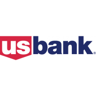
1. Describe in detail the image, and why you believe the company selected the brand elements (color, size, layout, character, etc.) that they did. Your analysis should include a brief description of the competitors and how your selected brand logo compares. In other words, why did they choose the brand elements that they did.
When it comes to the US bank logo it is very patriotic representing the United States. When it comes to the color of the logo it is red, white, and blue, those three colors are the exact same colors that represents The United States of America and the color of the countries flag. The “US” is in bold for it shows respect towards the country and “bank” is lowercase because a bank is not important as the country and the bank knows that. The “US” has a perimeter of a red pentagon shape in the background that makes those letters stand out, the reason why the company wants “US” to stand out is because they want to gain our trust for they want to be our countries bank. By having those two letters it will gain favoritism for it shows that the company has pride just like their customers which is a way for them to relate. When it comes to US banks logo and their competitors they do something other companies don’t which is to relate to their customers for having pride towards America for Wells Fargo has no way to relate to their customers.
2. Describe the target market (ie. what segments are being targeted)? How do you know this is the target market? Did the company make good decisions to reach the target market?
When it comes to the target market of the company it is anyone who lives in the United States of America and has money that needs to be kept. You can tell that its citizens of people in the US because it has it in the name of the company “US”. Secondly you can tell because of the colors red, white, and blue; those three colors are basically the United States colors that represent the country. When looking at the company and their decisions of the logo they did a unique and perfect job, for they created a way to relate to their customers that no other bank has done other then citi bank. Relations between people and banks are important because it causes trust and as people they want to be able to trust that their hard earned money is in safe hands.
3. Does it work? Why or why not? Any general observations?
They logo for US Bank does work well for the company for it creates a way to relate to their customers that is not found between a bank and their customers. The relations between them create trust and as customers who give people the availability to touch their money, they want to know that they will not loose their money for it will be in good hands. Overall US Bank did a good job creating their logo for it distinguishes them from other banks and brings security to the customers as well.

