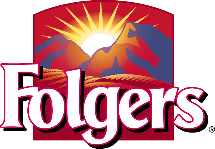
1. Describe in detail the image, and why you believe the company selected the brand elements (color, size, layout, character, etc.) that they did. Your analysis should include a brief description of the competitors and how your selected brand logo compares. In other words, why did they choose the brand elements that they did
The logo for Folgers is perfect for their product. Folgers product is coffee and as we know coffee has caffeine, which gives us energy and strength to stay awake. The logo has Folgers printed with two mountains in the back ground with the rising yellow sun in the middle. Everything is red except for the sun, and the color red in marketing means energy or strength and for coffee that is the main purpose of the drink because people drink it to get and stay awake. The rising sun shows when people mostly drink coffee which is when people wake up for it is a jump start to their day. When looking at their competitors such as Starbucks, Folgers does a good job describing what their product has to value within the picture in the logo. The reason why these elements were chosen were because its a perfect image of what their product is.

2. Describe the target market (ie. what segments are being targeted)? How do you know this is the target market? Did the company make good decisions to reach the target market
When looking at the target market through this logo you can see that the people being targeted are people who want a product to keep them awake or caffeine addicts. You can tell that because they used the color red which shows that energy and that their product can provide that service and want when it comes to needing energy. The mountains and the sun play a big role on defining their product for it represents the morning and as society knows, that when you wake up in the morning it is very difficult to function for that is when you are most tired. So the sun shows that their product is meant to provide a service to make the morning as enjoyable as possible. Overall the company did a great job reaching their target market.
3. Does it work? Why or why not? Any general observations?
The logo for Folgers does work for it shows us exactly on what to expect when we use the product. The product will provide us with energy and strength to start out day/morning. The logo also tells us when to use the product which is early in the morning before we get our day started. overall the logo for Folgers is a great example to show how to create a logo to represent and show what their product is and when to use it.
