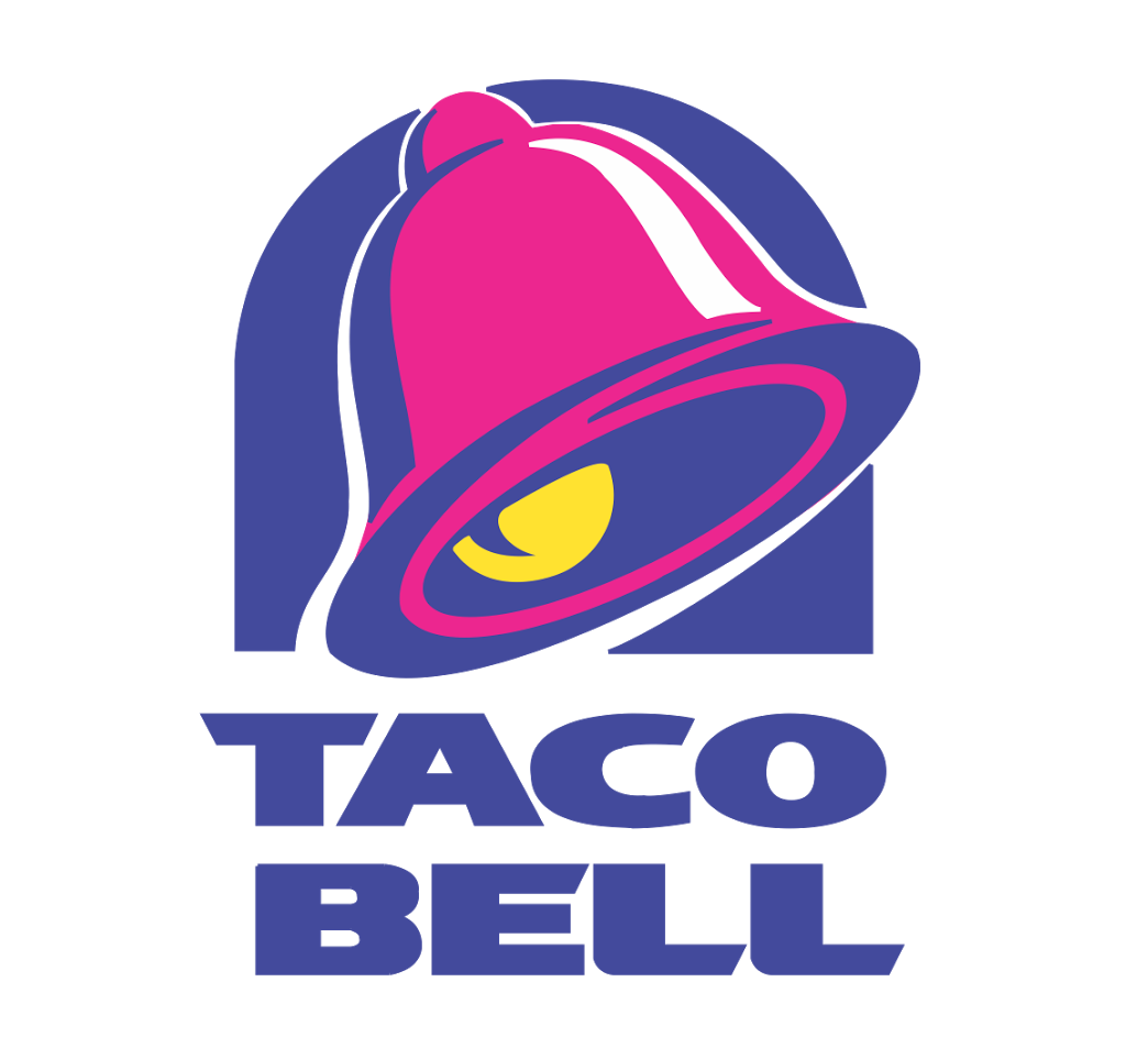
1. Describe in detail the image, and why you believe the company selected the brand elements (color, size, layout, character, etc.) that they did. Your analysis should include a brief description of the competitors and how your selected brand logo compares. In other words, why did they choose the brand elements that they did.
One late night I got really hungry and was driving around to see what was open other than McDonald’s and I saw this beautiful sign that is in the shape of a pink bell with a yellow clapper and blue lettering that read “Taco Bell” and under it said Live Mas which means live more in Spanish. The blue color stands for excellence and grace, and the pink stands for youthfulness and affection, while the yellow stands for happiness and joy. The reason why I believe they chose their colors was to show that Taco Bell’s food brings happiness and is a perfect late night snack. The reason why taco bell targeted youth was because they want to be known as a late night snack and the youth are the only people that stay up and out late at night. Taco Bell’s competitors include McDonald’s and Burger King. Taco Bells logo does a better job targeting the youth because of the happiness and joy it brings. Plus the youth isn’t content with the same thing over and over like McDonald’s plus they are more targeted to late night eating which is more target to the youth because they like to be up late for they have less responsibility. Overall Taco Bell choose their colors to tell the youth that their food is not only food but a life style that best suites them.
2. Describe the target market (ie. what segments are being targeted)? How do you know this is the target
The target market is towards the youth and people who have a busy life. You can tell its towards people who are busy because it’s a fast food chain, fast food chains are meant for quickness and for cheaper food with a trade off of quality. The main color of the logo is pink and pink resemble’s youth. Pink is also calm and eye catching and as millennial’s/youth we don’t have a large attention span and is triggered by anything shiny or different. So since the logo of taco bell is so different and unique it will attract their target market of people between the ages of 18-34. Also when it comes to the youth they don’t have much money to spend so they would most likely choose Taco Bell over a sit down restaurant.
3. Does it work? Why or why not? Any general observations?
The logo does work because its so unique that when you see the logo you just know that its Taco Bell. There is nothing like it, cheap Mexican fast food which is why the logo is perfect because its unique with colors and the shape of a bell. Most food places have a picture of food in their logo but taco bell does not, so it makes the restaurant different and young people like being hipster and different and not follow the social norms.

